The Unit Economics Command Centre: Building Your Profitability Dashboard
Most ecommerce dashboards track the wrong things.
11 min read · 23 February 2026
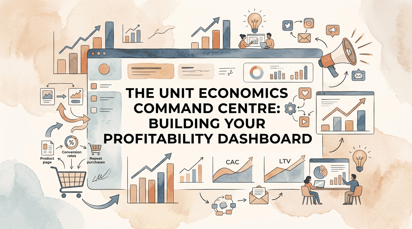
The Unit Economics Command Centre: Building Your Profitability Dashboard
Most ecommerce dashboards track the wrong things.
They show revenue. Order volume. Traffic. Conversion rate. These metrics tell you the business is moving—but not whether it's moving toward profit or away from it.
The brutal reality: you can hit record revenue while hemorrhaging cash. You can grow orders 40% while your unit economics deteriorate 20%. The metrics that feel good aren't necessarily the metrics that matter.
What you need isn't another vanity dashboard. You need a Unit Economics Command Centre—a single-pane view of the metrics that determine whether each sale makes you money, whether each customer is worth acquiring, and whether your business model actually works.
Unit economics is a simple yet powerful tool that can help you better understand the success and long-term sustainability of your business. The key is structuring your dashboard around the metrics that reveal true profitability, not just activity.
This article walks you through building that dashboard—the metrics to include, the calculations behind them, and the warning signals that demand attention.
The Dashboard Architecture
An effective unit economics dashboard operates at four levels. I call this the Unit Economics Intelligence Framework—a structured approach to understanding profitability from transaction through to total business health.
I developed this framework after seeing too many dashboards that tracked activity (orders, sessions, clicks) without connecting to economics (profit, payback, contribution). A dashboard that shows green when revenue is up but doesn't reveal that margin is down isn't intelligence—it's decoration. This framework ensures every metric connects to actual business value.
Level 1: Order Economics
What happens at each transaction? Revenue, costs, and margin at the order level.
Level 2: Customer Economics
What's the relationship worth? Acquisition cost, lifetime value, and payback.
Level 3: Channel Economics
Which sources work? Performance by acquisition channel and marketing investment.
Level 4: Business Economics
Is the model viable? Aggregate profitability, efficiency ratios, and trend trajectories.
Most operators focus almost exclusively on Level 1 (revenue, orders) and miss the deeper insights available at Levels 2-4. The Unit Economics Intelligence Framework ensures your dashboard surfaces all four levels with appropriate drill-down capability.
Level 1: Order-Level Metrics
These metrics answer: "What do we earn on each transaction?"
1.1 Average Order Value (AOV)
Calculation: Total Revenue / Total Orders
Significance: AOV directly impacts profitability because fixed costs per order (pick, pack, payment processing minimum) spread across higher AOV.
Dashboard Display:
- Current period AOV vs. previous period
- AOV trend (13-week rolling average)
- AOV by channel (organic, paid, email, etc.)
- AOV by customer type (new vs. returning)
Warning Signal: AOV declining while order volume flat = customers buying less per visit.
1.2 Contribution Margin Per Order
Calculation: (Revenue - COGS - Variable Costs) / Orders
This is the most important order-level metric. It tells you what each order contributes toward covering fixed costs and generating profit.
The contribution margin is the revenue remaining after subtracting all variable costs from sales revenue—it helps identify the most profitable products and indicates how well the business can cover fixed costs.
Variable Costs to Include:
- Cost of goods sold (landed)
- Payment processing fees
- Pick, pack, ship costs
- Platform/marketplace fees
- Return cost allocation
- Variable marketing cost per order (total marketing spend / orders)
Dashboard Display:
- Contribution margin $ per order
- Contribution margin % (margin / revenue)
- CM trend over time
- CM by product category
- CM by channel
Warning Signal: Contribution margin declining while revenue growing = scaling unprofitably.
1.3 Order Profitability Distribution
Not all orders are equally profitable. This metric shows the distribution.
Calculation: Sort all orders by contribution margin, bucket into quintiles
Dashboard Display:
- Histogram of order profitability
- % of orders that are unprofitable
- Average margin in top quintile vs. bottom quintile
- Trend in distribution shape over time
Warning Signal: Growing percentage of unprofitable orders, especially if concentrated in specific channels or products.
Level 2: Customer-Level Metrics
These metrics answer: "Are customers worth acquiring?"
2.1 Customer Acquisition Cost (CAC)
Calculation: Total Marketing & Sales Spend / New Customers Acquired
Important: CAC should include ALL acquisition costs:
- Paid advertising spend
- Marketing team salaries (acquisition-focused)
- Agency fees
- Promotional discounts (acquisition-specific)
- Content creation (acquisition-focused)
Dashboard Display:
- Blended CAC (all channels combined)
- CAC by channel (paid social, paid search, email, organic, etc.)
- CAC trend (13-week rolling)
- CAC vs. first-order contribution margin
Warning Signal: CAC exceeding first-order margin AND rising—you're paying more than you earn on new customers.
2.2 Customer Lifetime Value (LTV or CLV)
Calculation Options:
Simple: Average Order Value × Purchase Frequency × Average Customer Lifespan
Contribution-Based: Average Contribution Margin Per Order × Predicted Order Count Per Customer
The contribution-based approach is more accurate because it focuses on what customers contribute to fixed cost coverage, not just revenue.
In a sustainable ecommerce business, a healthy 3:1 LTV:CAC ratio is typical—meaning the total value of a customer should be three times the cost of acquiring them.
Dashboard Display:
- Current LTV (contribution-based)
- LTV by acquisition channel
- LTV by customer cohort (acquisition month)
- LTV trend over time
- LTV by first-purchase category
Warning Signal: LTV declining across cohorts = retention weakening.
2.3 LTV:CAC Ratio
Calculation: Customer Lifetime Value / Customer Acquisition Cost
The single most important metric for evaluating customer economics viability.
Benchmarks:
- Below 1:1 = Losing money on each customer
- 1:1 to 3:1 = Marginal economics, risky
- 3:1 to 5:1 = Healthy, sustainable
- Above 5:1 = Under-investing in growth (or your LTV calculation is wrong)
Dashboard Display:
- Blended LTV:CAC
- LTV:CAC by channel
- LTV:CAC trend
- Target vs. actual
Warning Signal: LTV:CAC below 3:1 on any major acquisition channel = that channel may be unprofitable.
2.4 CAC Payback Period
Calculation: Customer Acquisition Cost / (Average Monthly Revenue Per Customer × Contribution Margin %)
This tells you how many months until a customer's contribution margin recovers their acquisition cost.
Benchmarks:
- Under 6 months = Excellent
- 6-12 months = Healthy
- 12-18 months = Acceptable for subscription/repeat models
- Over 18 months = Cash flow strain
Dashboard Display:
- Payback period in months
- Payback by channel
- Payback trend
- Cash tie-up in customer acquisition (CAC × new customers × payback months)
Warning Signal: Payback period extending while growth accelerating = cash crisis approaching.
Level 3: Channel-Level Metrics
These metrics answer: "Where should we invest acquisition dollars?"
3.1 Marketing Efficiency Ratio (MER)
Calculation: Total Revenue / Total Marketing Spend
MER provides a blended view of marketing efficiency across all channels. Unlike ROAS, it doesn't try to attribute revenue to specific channels—it shows overall relationship between marketing investment and revenue generated.
Variable costs including CAC and cost of delivery should total no more than 50% of revenue, which implies MER of at least 4:1 when marketing is the primary variable cost.
Dashboard Display:
- Current MER
- MER trend (13-week rolling)
- MER vs. target
- Seasonal MER patterns
Warning Signal: MER declining while spend increasing = diminishing returns on marketing scale.
3.2 Channel-Specific ROAS
Calculation (per channel): Revenue Attributed to Channel / Spend on Channel
While attribution is imperfect, channel ROAS helps identify relative performance even if absolute numbers are inflated.
Dashboard Display:
- ROAS by major channel (Meta, Google, TikTok, Email, etc.)
- ROAS trend by channel
- ROAS vs. breakeven threshold
- Spend allocation vs. ROAS ranking
Warning Signal: High-ROAS channels receiving less spend than low-ROAS channels = misallocation opportunity.
3.3 New Customer Percentage by Channel
Calculation (per channel): New Customers Attributed / Total Customers Attributed
This reveals which channels acquire new customers versus reactivate existing ones. Retargeting might show high ROAS but acquire zero new customers.
Dashboard Display:
- New customer % by channel
- Trend over time
- Channel mix weighted by new customer contribution
Warning Signal: "High performance" channels with <20% new customers = you're paying to convert customers who would convert anyway.
Level 4: Business-Level Metrics
These metrics answer: "Does the model work?"
4.1 Gross Margin Percentage
Calculation: (Revenue - COGS) / Revenue
The foundation of profitability. If gross margin is insufficient, no amount of operational efficiency saves the business.
Benchmarks by Category:
- Fashion/Apparel: 50-65%
- Health & Beauty: 55-70%
- Home Goods: 40-55%
- Electronics: 25-40%
- Food/Consumables: 40-60%
Dashboard Display:
- Gross margin % (current period)
- Gross margin trend
- Gross margin by category/product
- Gross margin vs. benchmark
Warning Signal: Gross margin declining quarter-over-quarter without operational offsets = structural profitability problem.
4.2 Operating Profit Margin
Calculation: Operating Profit / Revenue
The ultimate measure of business model viability.
Top-performing ecommerce businesses achieve net profit margins above 20%, while median sits at about 8%.
Dashboard Display:
- Operating margin % (current period)
- Operating margin trend
- Path to profitability (if currently unprofitable)
- Scenario impact on margin
Warning Signal: Revenue growing faster than operating profit = scaling inefficiently.
4.3 Contribution Margin After Marketing
Calculation: (Gross Profit - Marketing Spend) / Revenue
This metric isolates the relationship between margin and marketing investment—critical for growth-stage businesses.
Dashboard Display:
- CM after marketing %
- Trend over time
- Target vs. actual
- Breakeven marketing spend level
Warning Signal: CM after marketing negative = business loses money before any fixed costs are considered.
4.4 Fixed Cost Coverage Ratio
Calculation: Total Contribution Margin / Fixed Costs
This shows how well your variable profit covers your fixed cost base.
Benchmarks:
- Below 1.0 = Unprofitable, burning cash
- 1.0 to 1.2 = Breakeven zone
- 1.2 to 1.5 = Healthy margin of safety
- Above 1.5 = Strong profitability
Dashboard Display:
- Coverage ratio
- Trend over time
- Scenario coverage ratios
- Distance from breakeven
Warning Signal: Coverage ratio declining toward 1.0 = profitability eroding.
The 30-Day Dashboard Implementation Sprint
Phase 1: Foundation (Days 1-10)
Week 1: Data Audit and Integration
- Inventory all data sources (ecommerce platform, accounting, marketing, payment)
- Identify data gaps and quality issues
- Select integration middleware (Segment, Fivetran, or ecommerce-specific tools)
- Begin data pipeline setup
Phase 2: Build (Days 11-20)
Week 2-3: Calculation and Visualisation Layer
- Build order enrichment logic (COGS, shipping, fees)
- Implement customer tagging (new vs. returning, acquisition channel)
- Configure marketing attribution model
- Create executive, operational, trend, and alert views
Phase 3: Operationalise (Days 21-30)
Week 4: Review Cadence and Alerts
- Establish daily, weekly, and monthly refresh schedules
- Configure alert thresholds for key metrics
- Run first weekly review ritual
- Document metric definitions and targets
Building the Dashboard: Technical Requirements
Data Requirements
Your dashboard needs clean, integrated data from:
- Ecommerce Platform: Orders, revenue, products, customers
- Accounting System: COGS, operating expenses, P&L
- Marketing Platforms: Spend by channel, attributed conversions
- Payment Processor: Transaction fees, chargebacks
- Fulfillment/Shipping: Cost per order data
Data integration is the hardest part. Consider middleware like Segment, Fivetran, or ecommerce-specific tools like Daasity or Glew.
Calculation Layer
Build a calculation layer that transforms raw data into metrics:
- Order Enrichment: Add COGS, shipping cost, and fees to each order
- Customer Tagging: Flag new vs. returning, acquisition channel, cohort
- Marketing Attribution: Apply consistent attribution model across channels
- Metric Calculation: Compute all Level 1-4 metrics
Visualisation Layer
Structure your dashboard views:
Executive View: One page showing health traffic lights
- LTV:CAC (green >3:1, yellow 2-3:1, red <2:1)
- Contribution margin % (green >30%, yellow 20-30%, red <20%)
- MER (green >4:1, yellow 3-4:1, red <3:1)
- Operating margin (green >10%, yellow 0-10%, red <0%)
Operational View: Detailed metrics with drill-down capability
Trend View: 13-week and 52-week trends for key metrics
Alert View: Metrics outside acceptable ranges with severity indicators
Refresh Cadence
- Daily: Revenue, orders, marketing spend, MER
- Weekly: Contribution margin, channel performance, CAC
- Monthly: LTV updates, cohort analysis, operating margin
- Quarterly: Full LTV recalculation, strategic metric review
Common Dashboard Mistakes
Mistake 1: Revenue Focus
Tracking revenue growth without contribution margin = flying blind on profitability
Mistake 2: Platform-Reported ROAS
Trusting platform attribution without independent verification = over-stated performance
Mistake 3: Aggregate Averages
Looking only at blended metrics without channel/cohort breakdown = missing critical variations
Mistake 4: Point-in-Time Only
Showing current metrics without trends = missing directional signals
Mistake 5: No Targets
Displaying metrics without benchmarks or targets = no context for performance evaluation
Key components of ecommerce FP&A include budgeting, financial forecasting, variance analysis, profitability analysis, and scenario modeling—these components work together to provide a holistic view. Your dashboard should support all of these functions.
The Weekly Dashboard Review Ritual
Having a dashboard means nothing if you don't use it. Implement a weekly review cadence:
Monday Morning (30 minutes):
- Review traffic lights on executive view
- Identify any metrics outside acceptable range
- Note significant week-over-week changes
- Flag items for deeper investigation
Mid-Week Deep Dive (60 minutes):
- Investigate flagged items from Monday
- Review channel-level performance
- Assess new customer acquisition quality
- Compare actual vs. planned performance
Monthly Close (2 hours):
- Full metric review with month-over-month and year-over-year comparison
- Cohort analysis update
- LTV/CAC recalculation
- Strategic implications and action items
From Metrics to Action
A dashboard is worthless without decision triggers. For each key metric, define:
1. Target Range: Where should this metric be?
2. Warning Threshold: At what point do you investigate?
3. Action Threshold: At what point do you act?
4. Response Protocol: What action do you take?
Example:
- Metric: Contribution margin per order
- Target: >$25
- Warning: Falls below $22 for 2 consecutive weeks
- Action: Falls below $20 or downward trend for 4 weeks
- Response: Price review, COGS audit, promotional strategy assessment
Build this decision framework for every Level 4 metric and your most critical Level 2-3 metrics. The dashboard then becomes a decision support system, not just a reporting tool.
The New North Star Metric: Unit Economics Health Score
Stop tracking individual metrics in isolation. Start measuring your Unit Economics Health Score (UEHS)—a composite index that provides an at-a-glance view of your business health.
The Calculation:
UEHS = (CM% Score × 0.25) + (LTV:CAC Score × 0.25) + (Payback Score × 0.20) + (MER Score × 0.15) + (Margin Trend Score × 0.15)Where each component is normalised to 0-100 based on target vs. actual performance.
Interpretation:
- UEHS > 80: Excellent—unit economics supporting sustainable growth
- UEHS 60-80: Healthy—fundamentals sound with optimisation opportunity
- UEHS 40-60: Concerning—one or more critical metrics underperforming
- UEHS < 40: Critical—business model viability in question
This single score answers the question "how are we really doing?" without requiring analysis of dozens of individual metrics. It's your executive summary metric—the number you check first every Monday.
The Decision Clarity
Your Unit Economics Command Centre
The goal isn't dashboard perfection—it's decision clarity.
You should be able to answer, at any moment:
- Are we making money on each order?
- Are customers worth acquiring?
- Which channels actually work?
- Is the business model viable?
If your current dashboards can't answer these questions with data, you're operating on intuition in a business that rewards precision.
Build the unit economics command centre. Implement the review cadence. Define your decision triggers.
Then let the data guide you toward profitable growth rather than just growth.
Unit Economics Calculator
Contribution margin per order after COGS, shipping and fees — the number scaling actually depends on.
Return on Ad Spend (ROAS) Optimization Framework
Contribution Margin Calculator by Product [Tool]
Break-Even Analysis Calculator [Tool]
Customer Lifetime Value (CLV) Modeling Framework
Ratio Analysis for Ecommerce: The Operator Pack That Actually Works
The Unit Economics Lie: Why Your "Profitable" eCommerce Business Is Actually Bleeding Cash
Newsletter
The Uncommon Insights Letter
Practical FMCG & eCommerce growth playbooks — margins, retention and scaling tactics, straight to your inbox.
Turn unit economics into profit you can see
Get a hands-on operator to turn the frameworks above into results — book a free audit call.