Funnel Bottlenecks: Causes and Solutions
Slow pages, weak CTAs and lengthy forms are bleeding revenue — fix page speed, simplify checkout and optimise CTAs to lift eCommerce conversions.
29 January 2026
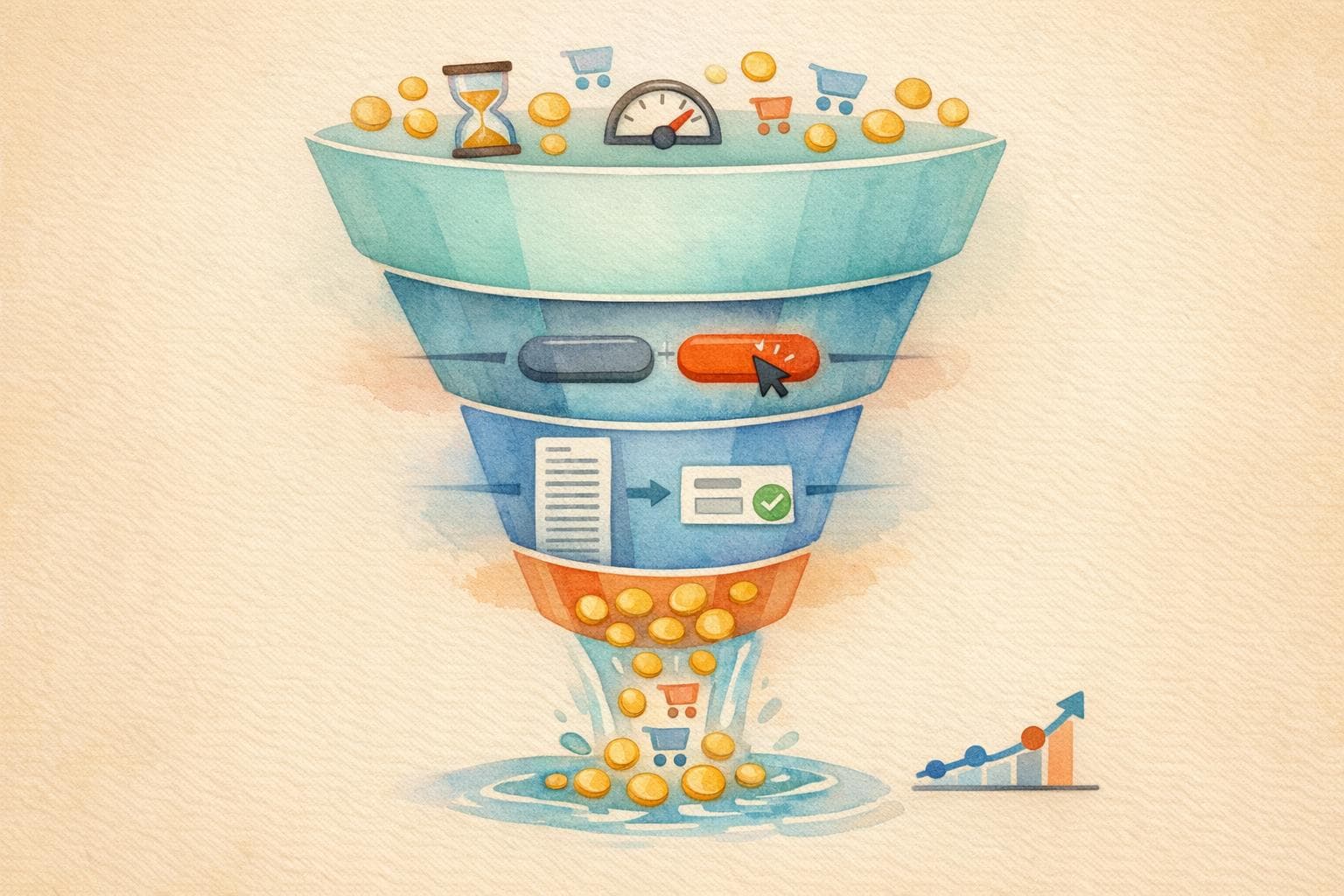
Your sales funnel could be leaking revenue, with potential customers abandoning their journey before converting. Common issues like slow-loading pages, unclear calls-to-action (CTAs), and complicated forms are major roadblocks for Australian FMCG and eCommerce businesses. The good news? Fixes like improving page speed, simplifying checkout processes, and optimising CTAs can significantly boost your conversion rates.
Key Takeaways:
- Slow Page Load Times: A 2-second delay increases bounce rates by 32%. Compress images, optimise code, and use a CDN to improve speed.
- Weak CTAs: Replace generic buttons with clear, action-oriented phrases like "Get My 20% Discount". Ensure buttons are mobile-friendly.
- Form Abandonment: Long forms drive users away. Simplify fields, enable guest checkout, and use autofill options.
- Trust Issues: Missing security badges or unclear return policies deter shoppers. Add trust signals and display total costs upfront.
Fixing bottlenecks is faster and more cost-effective than acquiring new traffic. A 10% improvement in conversion metrics can make a big impact on revenue. Regular growth audits help identify and resolve these issues efficiently.
Conversion Rate Optimization: Find Funnel Bottlenecks and Improve What Matters (Samir ElKamouny)
What Causes Funnel Bottlenecks
Pinpointing why customers abandon your funnel requires identifying the friction points they encounter during their buying journey. For mid-sized Australian eCommerce businesses, these bottlenecks often arise from technical hiccups, unclear communication, and overly complicated processes that drive potential buyers away.
Slow Page Load Times
Page speed plays a massive role in keeping customers engaged. A delay of just two seconds can increase bounce rates by 32%. Despite this, the average mobile page takes a frustrating 8.6 seconds to load - far beyond the 2.75-second threshold where users start losing patience.
Factors like oversized images, uncompressed videos, and too many third-party scripts are common culprits for sluggish pages. Mobile users, who account for 62% of global web traffic, are particularly affected by these delays.
Here’s the upside: improving page load times has been shown to increase conversion rates by as much as 75%, along with boosting overall traffic.
"Every millisecond matters... The more successful your ecommerce site becomes, the more it can start to slow down." - Mandie Sellars, Growth Strategist
Now, let’s look at how unclear calls-to-action (CTAs) disrupt the buying process.
Unclear or Weak CTAs
If your calls-to-action leave users guessing, they’re less likely to take the next step. Generic phrases like "Submit" or "Click here" don’t inspire action, while specific, benefit-driven language like "Get My 20% Discount" clearly communicates value.
Confusion also arises when a page tries to achieve too many goals at once. Broken links or buttons that fail to load completely halt progress, no matter how motivated the customer is. On mobile devices, poorly designed CTAs - like buttons that blend into the background or are too small to tap easily (they should be at least 44 by 44 pixels) - add another layer of frustration.
Adding urgency with phrases like "Only 3 left in stock" or "Sale ends tonight" can help push customers to act. Without these nudges, many leave with the intention of returning later, often never following through.
High Form Abandonment
Long, complicated forms are another major roadblock. Many mid-sized eCommerce businesses focus too heavily on gathering data, creating lengthy forms that drive customers away. Requiring users to create an account before checking out is another common mistake that cuts the journey short.
On top of that, poorly optimised forms for mobile users exacerbate the issue. Missing autofill options, unclear error messages, and a lack of trust signals like security badges or transparent return policies all contribute to higher abandonment rates.
"Businesses sometimes prioritise data collection over user experience or fail to optimise the checkout page." - Stripe
Unexpected costs popping up at the last second also cause customers to exit immediately. And when follow-up efforts are lacking, the opportunity to re-engage is often lost.
Poor Lead Nurturing
When follow-ups are slow or irrelevant, potential customers lose interest quickly. Delayed responses or generic communication can drag out the sales process unnecessarily.
A big part of the problem is data silos. When web analytics and CRM systems don’t work together, teams struggle to see where and why users drop off. Without this unified insight, it’s impossible to personalise follow-ups or address specific concerns that might be holding a prospect back.
Low Proposal Conversion Rates
Proposals that fail to create urgency or demonstrate clear value often fall flat. If quotes don’t highlight the benefits of acting now or leave out essential details about shipping, returns, or product quality, customers are more likely to delay their decision indefinitely.
When proposals don’t address uncertainties or provide compelling reasons to act, leads are left hesitant, and conversions suffer.
How to Fix Funnel Bottlenecks
Once you've pinpointed where customers are dropping off, it’s time to tackle those problem areas with targeted solutions. These fixes can often be implemented quickly and deliver noticeable improvements.
Speed Up Page Load Times
Start by focusing on image compression. Converting images to WebP format can shrink file sizes by about 30% without compromising quality. For videos, use lightweight embeds that load only thumbnails initially, which can save up to 1MB per page.
Next, optimise your code. Minify HTML, CSS, and JavaScript files, and use 'async' or 'defer' attributes on scripts to prevent them from blocking the browser. A Content Delivery Network (CDN) can also help by serving content from servers closer to your users, reducing load times.
Enable lazy loading for images and videos to improve performance. On mobile, disable video autoplay to conserve bandwidth, and set explicit width and height attributes for images to prevent layout shifts.
Real-world examples highlight the benefits of these changes. In September 2024, Transformer Table improved its site speed by 67% and doubled its conversion rate by moving to optimised infrastructure. Similarly, Molekule, an air purifier retailer, saw a 75% increase in device conversion rates and a 10% traffic boost after making similar adjustments.
"Quick speed hacks will not build the foundation for long-term performance - only real speed improvements will, and that starts with optimising your underlying theme architecture." - Nirav Sheth, CEO and Founder, Anatta
To track your progress, use tools like Google PageSpeed Insights or GTmetrix. Aim for a Largest Contentful Paint (LCP) under 2.5 seconds and a Time to First Byte (TTFB) below 800 milliseconds. After addressing speed issues, turn your attention to refining your CTAs.
Improve CTAs for Better Engagement
Swap out generic phrases like "Submit" or "Click here" for action-oriented language that clearly conveys value. Examples include "Get My 20% Discount", "Add to Cart", or "Start My Free Trial".
Make sure your CTAs are visually distinct by using contrasting colours that stand out. For mobile users, ensure buttons are at least 44 by 44 pixels, with enough white space to avoid accidental taps.
Position your main CTA above the fold so it’s immediately visible. On longer pages, repeat the CTA or use a sticky button that stays accessible as users scroll. Removing distractions like competing links or sidebar content can also help keep users focused on your desired action.
Experiment with A/B testing to refine your CTAs. For instance, test "Buy Now" against "Add to Cart", or try urgency-driven phrases like "Claim your limited-time offer" (but only if scarcity is genuine).
"The CTA button is where conversions happen. Don't default to boring button copy... Make CTAs specific and action-oriented so visitors know exactly what they're getting when they click." - Shopify Staff
Once your CTAs are optimised, simplify your forms to reduce checkout friction.
Simplify Forms
Start by eliminating unnecessary fields. For initial lead capture, stick to essentials like email and name. You can collect additional details later once trust has been established. Studies show that reducing checkout forms from an average of 11.3 fields can significantly boost conversions.
Offer guest checkout to avoid forcing account creation, which causes 63% of online shoppers to abandon their carts. Let customers complete their purchase as guests, and then encourage account creation as an optional follow-up.
Use browser autofill to speed up form completion and reduce errors. Real-time address validation tools like Loqate can further simplify data entry by allowing users to find their address in a single field.
For longer forms, add progress indicators to show users how close they are to finishing. This visual feedback can ease anxiety and reduce abandonment rates. Wherever possible, consolidate multi-page checkouts into a single-page format to keep the process streamlined.
Comparison of Bottleneck Solutions
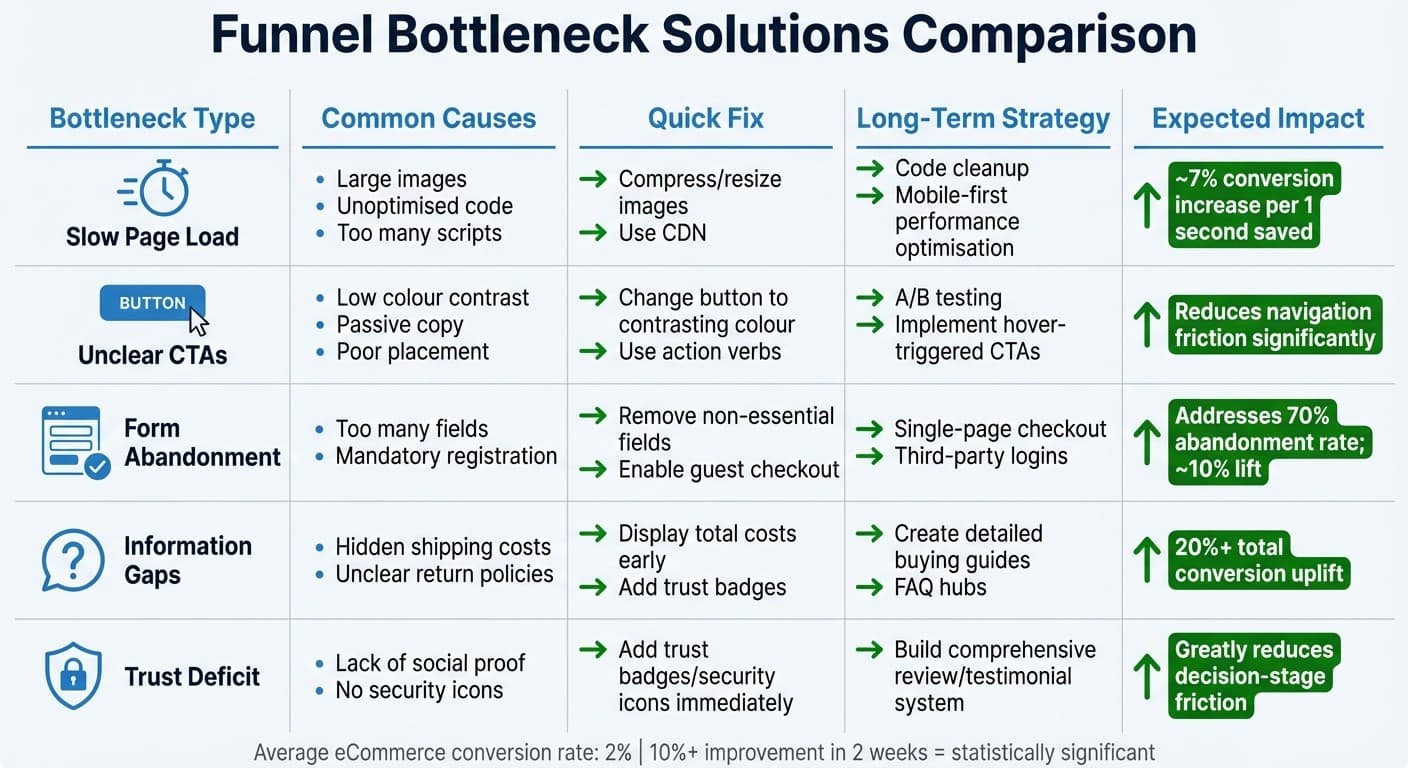
Funnel Bottleneck Solutions: Quick Fixes vs Long-Term Strategies
After addressing issues like page speed, CTAs, and forms, it's crucial to evaluate solutions for common bottlenecks. The table below breaks down typical funnel problems, their causes, quick fixes, long-term strategies, and the kind of improvements you can expect. Customising these solutions to match specific bottlenecks can help you maximise your returns.
| Bottleneck | Common Causes | Quick Fix | Long-Term Strategy | Expected Improvement |
|---|---|---|---|---|
| Slow Page Load | Large images, unoptimised code, too many scripts | Compress/resize images; use a CDN | Code cleanup; mobile-first performance optimisation | ~7% conversion increase per 1 second saved |
| Unclear CTAs | Low colour contrast, passive copy, poor placement | Change button to a contrasting colour; use action verbs | A/B testing; implement hover-triggered CTAs | Reduces navigation friction significantly |
| Form Abandonment | Too many fields, mandatory registration | Remove non-essential fields; enable guest checkout | Implement single-page checkout; third-party logins | Addresses 70% abandonment rate; ~10% lift |
| Information Gaps | Hidden shipping costs, unclear return policies | Display total costs early; add trust badges | Create detailed buying guides and FAQ hubs | 20% or more in total conversion uplift |
| Trust Deficit | Lack of social proof, no security icons | Add trust badges/security icons immediately | Build comprehensive review/testimonial system | Varies but greatly reduces decision-stage friction |
These comparisons highlight the importance of regular growth audits to uncover and address new bottlenecks as they arise.
The average eCommerce conversion rate sits at around 2%, and achieving an improvement of over 10% within two weeks is considered statistically significant. To prioritise which fixes to tackle first, consider using the PIE framework. This system scores potential solutions based on their Impact and Ease of implementation. For instance, compressing images can deliver immediate results, while more complex fixes like code optimisation may take longer to show benefits.
"Every one second of delay in site load time can reduce your eCommerce conversion rate by 7%." - Kissmetrics
It's worth noting that returning customers spend 67% more than new ones. Quick wins not only recover lost revenue but also pave the way for sustained growth through long-term strategies. By relying on regular audits and this structured approach, you can maintain and even enhance your conversion gains over time.
Using Growth Audits to Find and Fix Bottlenecks
A growth audit is a detailed examination of your customer journey that pinpoints where users drop off at each stage. Instead of making assumptions about where your funnel might be underperforming, this process helps direct your time and budget to the areas that can deliver the biggest improvements.
The process combines tools like GA4 for tracking user behaviour and Hotjar for gathering qualitative feedback, helping you understand both the "what" and the "why" behind drop-offs. Tools like BrowserStack are also used to test your site's performance across different browsers and devices. These insights translate into actionable fixes, as demonstrated in various case studies.
Growth audits don’t just identify where users are leaving - they also uncover technical issues that might be affecting your site's performance. For example, Uncommon Insights specialises in conducting these audits for FMCG and eCommerce businesses, focusing on areas like acquisition strategies, unit economics, and marketing effectiveness. One standout example is a growth audit at Sainsbury's, where a "click and collect" bug caused a 47.7% checkout abandonment rate. Fixing this issue recovered over $200,000 in quarterly revenue. Similarly, Classic Vacations identified display issues that led to an 86% drop in weekly revenue. Once the problem was resolved, bookings returned to normal levels.
In addition to technical fixes, growth audits also examine financial metrics that influence funnel performance. They assess unit economics by comparing customer lifetime value (LTV) with customer acquisition cost (CAC), ensuring your marketing spend is both effective and sustainable. By identifying which campaigns attract the most valuable customers, businesses can shift resources to top-performing channels and fine-tune their messaging for better results. For established businesses, it’s recommended to conduct growth audits every three to six months or after hitting milestones like 10,000 monthly users. These regular check-ups are essential for keeping your funnel optimised in an ever-changing market.
"In God we trust - all others bring data." - W. Edwards Deming
Conclusion
Funnel bottlenecks can directly cut into your revenue. Fixing these issues means consistently tracking, testing, and adjusting based on actual user behaviour and changing market trends. Whether it’s slow-loading pages, unclear calls-to-action (CTAs), or overly complex forms, each of these obstacles leads to higher drop-off rates.
The best strategy blends quantitative data - to pinpoint where users leave - with qualitative insights that explain why. This combination enables data-driven decisions that produce tangible results. Focusing on improvements at the bottom of the funnel, especially at the conversion stage, often yields a bigger revenue boost compared to changes at the top.
Aiming for a 2% conversion rate across your funnel is a solid benchmark. Achieving and maintaining this, however, requires more than quick fixes. It calls for a comprehensive understanding of your customer journey across all channels, accurate tracking systems, and frequent audits to catch and address new bottlenecks as they arise.
To tackle these challenges, Uncommon Insights offers growth audits tailored for businesses earning $1M–$10M annually. These audits identify both technical and financial performance issues, ensuring your marketing spend remains effective and efficient. By conducting these reviews every three to six months, you can keep your funnel running smoothly, even as market conditions shift.
FAQs
How can I spot and fix bottlenecks in my sales funnel?
To figure out where your sales funnel might be losing steam, start by digging into the numbers. Look closely at the metrics for each stage of the customer journey. If you notice a sharp drop in conversion rates - say, between the awareness and consideration stages or from consideration to purchase - that's a red flag for potential friction.
Some common culprits behind these drops include slow-loading pages, vague or poorly placed calls-to-action (CTAs), and confusing site navigation. Tools like heatmaps and session recordings can give you a clearer picture of how users interact with your site. These tools help identify where people hesitate, get stuck, or leave the process entirely.
It's also smart to compare your funnel's performance with industry benchmarks. This can help you spot gaps and see where you're falling short. By blending data analysis with insights into user behaviour, you can focus on fixing the most pressing issues, making the entire funnel run more smoothly.
How can I speed up my website's page load times?
Improving how quickly your website loads is key to creating a better experience for users and increasing conversions. Start by compressing images - this reduces their file size while keeping them looking sharp. Next, use a Content Delivery Network (CDN) to ensure your content is delivered quickly to users no matter where they are. Enabling browser caching is another smart move, as it stores frequently accessed data locally, cutting down on load times.
You’ll also want to cut back on heavy scripts and third-party resources. Simplify your website's code by minifying CSS, JavaScript, and HTML files. Tools like Google Lighthouse can help you regularly test your site’s performance, flagging any issues and showing where you can make improvements. By following these steps, you’ll not only speed up your site but also make it more competitive in today’s fast-paced online world.
What’s the best way to optimise calls-to-action for higher conversions?
To make your calls-to-action (CTAs) more effective, focus on making them clear, visible, and well-designed. Use bold, contrasting colours to ensure they grab attention and are easy to click. Simple, action-focused text like "Get Started" or "Shop Now" tends to work better than vague phrases like "Click Here".
Where you place your CTAs matters too. Position them in prominent spots that align with the flow of your page and the user's journey. Adding some whitespace around your CTAs can help them stand out by reducing visual clutter. Lastly, experiment with different designs and wording to find what clicks with your audience. Even small adjustments can lead to noticeable boosts in engagement and conversions.
Related Blog Posts
Shopify conversion rate optimization checklist
Case Study: Improving Checkout Speed for eCommerce
How Website Speed Impacts Ecommerce Sales
How to Optimize Above-the-Fold Content for DTC Brands
Customer Behavior in Funnel Stages: Key Metrics
How to Map DTC Customer Touchpoints
Newsletter
The Uncommon Insights Letter
Practical FMCG & eCommerce growth playbooks — margins, retention and scaling tactics, straight to your inbox.
Turn these ideas into profit you can see
Get a hands-on operator to turn the frameworks above into results — book a free audit call.