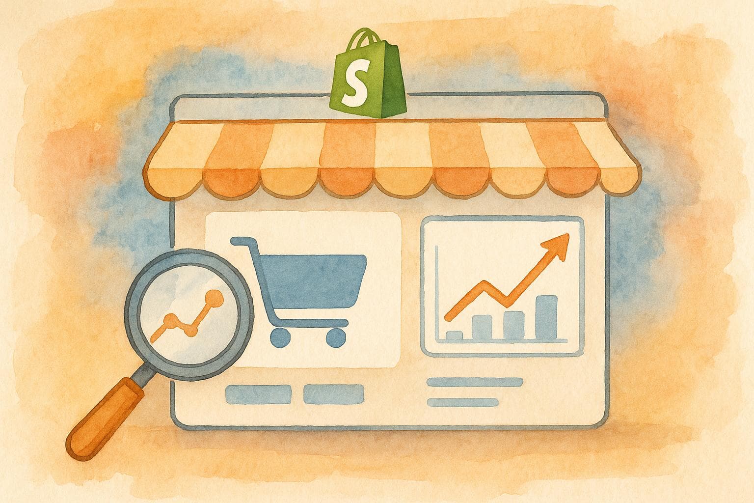
Shopify conversion rate optimization checklist
Boost your Shopify store's sales with effective conversion rate optimization strategies, from data analysis to user experience improvements.
10 July 2025
Every Shopify store owner wants more sales without spending extra on ads. The key? Boost your conversion rate - the percentage of visitors who buy something. On average, Shopify stores convert at just 1.4%, but with the right strategies, you can double or even triple that. Here's how:
- Understand your data: Use Shopify Analytics, Google Analytics, and tools like Hotjar to track where visitors drop off.
- Set clear goals: For example, aim to lower cart abandonment from 70% to 60% in 3 months.
- Improve user experience: Simplify navigation, optimize for mobile, and speed up page load times.
- Fix checkout issues: Offer guest checkout, reduce form fields, and show shipping costs upfront.
- Enhance product pages: Use high-quality images, detailed descriptions, and customer reviews.
- Recover abandoned carts: Send follow-up emails and retarget users with ads.
Conversion optimization is all about small, consistent improvements that lead to big results over time. Let’s dive into the details to turn visitors into paying customers.
The Ultimate E-Commerce Shopify Conversion Rate Checklist

Data Analysis and Goal Setting
To implement the checklist's strategies effectively, you need a solid, data-driven approach. Start by analyzing your store's current performance. This is the cornerstone of conversion rate optimization (CRO) - using data and clear goals to guide meaningful improvements.
Setting Conversion Goals and Key Metrics
Set goals that are specific, measurable, achievable, relevant, and time-based (SMART). Research shows that well-defined objectives can triple your chances of success.
Begin by understanding where you currently stand. For example, the average Shopify store conversion rate is around 1.4%, which is notably lower than the general eCommerce average of 2.5–3%. This gap highlights a huge opportunity to boost performance.
When defining your goals, aim for precision. Instead of a vague goal like "increase sales", try something like: "Raise the conversion rate from 1.2% to 2.0% within six months" or "Lower cart abandonment from 75% to 65% by the end of Q3." These specific targets give you measurable benchmarks to track progress.
Your key metrics should cover both macro conversions (primary goals like purchases, signups, or account creations) and micro conversions (smaller actions that lead to those goals, such as adding items to the cart or starting checkout).
Here are some key metrics to monitor:
Primary Conversion Metrics:
- Conversion rate (purchases divided by total visitors)
- Ecommerce conversion rate by traffic source
- Cart abandonment rate
- Average order value (AOV)
- Revenue per visitor
Supporting Metrics:
- Bounce rate (percentage of visitors leaving after viewing one page)
- Average time spent on site
- Pages viewed per session
- Click-through rates on product pages
- Exit rates on key pages
Device-specific performance is also critical. Desktop conversion rates typically range from 2–4%, while mobile conversions often fall between 1–2.5%. Returning visitors tend to convert at higher rates (4.5–9%) compared to new visitors (1–3%).
Once your goals are set, choose analytics tools that help you uncover actionable insights.
Analytics Tools for CRO
The right tools can provide the insights you need to make informed decisions. Your choice will depend on your business size, goals, and resources.
Start with free options like Shopify Analytics and Google Analytics 4 (GA4). Shopify Analytics offers essential metrics such as sales data, top products, and customer behavior, while GA4 provides deeper insights into user journeys, traffic sources, and conversion paths.
As your business grows, consider investing in specialized tools:
- Triple Whale ($129/month): Tracks customer acquisition costs, lifetime value, and marketing attribution through detailed dashboards.
- Peel Insights ($69/month): Great for cohort analysis and retention tracking.
- Polar Analytics ($40/month): Ideal for businesses managing campaigns across multiple platforms.
For visual insights, tools like Hotjar can help you understand how users interact with your site. Heatmaps show where visitors click, how far they scroll, and which elements grab their attention - perfect for spotting friction points that may not show up in traditional analytics.
If you have specific challenges, choose tools tailored to your needs. For instance, if email marketing is a priority, Segments Analytics ($59/month) offers customer segmentation for email and SMS campaigns. For businesses managing multiple stores, Daasity provides enterprise-level analytics with custom pricing.
Running a Growth Audit
Once you've set goals and equipped yourself with analytics tools, the next step is a comprehensive growth audit. This helps you identify bottlenecks in your conversion funnel and prioritize fixes.
Start with a funnel analysis to see where users drop off. Common problem areas include:
- High bounce rates on landing pages
- Low click-through rates from category pages to product pages
- Abandoned carts during checkout
- Abandoned forms on account creation pages
Use your analytics tools to examine traffic patterns and identify pages with high exit rates or low engagement. For example, review product pages by tracking metrics like time spent on the page, scroll depth, and add-to-cart rates. If a high-traffic product has a low conversion rate, you may need to improve its description, images, pricing display, or social proof.
Evaluate your checkout process step by step. Look for barriers like lengthy forms, hidden costs, limited payment options, or forced account creation. Each of these can discourage customers from completing their purchase.
Technical performance is another critical factor. Slow page load times, especially on mobile devices, can hurt your conversions. Use tools like Google PageSpeed Insights to identify and address technical issues that might be slowing your site down.
Document your findings in an action plan, prioritizing fixes that will impact the most visitors or generate the highest revenue. For instance, if mobile checkout abandonment is a significant issue, focus on improving that area before tackling lower-priority problems.
Regular audits are essential to keeping up with changing customer behaviors and expectations. By staying proactive, you can continuously refine your strategy for better results.
Store Design and User Experience
The design and user experience of your store directly influence how well it converts visitors into customers. Think of your store's design as the online version of a storefront - it needs to invite people in and encourage them to explore. With users forming opinions about websites in just 50 milliseconds, every design element must work together to create a positive first impression that leads to action.
Making a Strong First Impression
Your store’s design is often the first thing visitors notice, and it plays a huge role in building trust. Studies reveal that 94% of users leave websites with poor design, and 75% of users judge a company’s credibility based on its website design.
To start, your homepage layout should be clean and easy to navigate. Avoid clutter that might overwhelm visitors. A high-quality logo that reflects your brand’s personality is essential - place it prominently in the header and link it back to the homepage, as this is a standard user expectation.
Choose a color scheme that aligns with your brand and resonates emotionally with your audience. For instance, in the U.S., blue often conveys trust, while green can suggest eco-consciousness or financial prosperity. Pair this with fonts that are easy to read on all devices while complementing your brand's style.
High-resolution product images are a must. Poor-quality visuals can discourage potential customers, so ensure your images are clear and optimized for fast loading. These visuals should tell a story about your brand and products, creating a connection with your audience.
Your value proposition - what makes your store or product special - should be front and center. Visitors should immediately understand what you offer and why they should choose you. Keep your messaging sharp and engaging without bombarding them with too much information.
Brands like Allbirds excel at this. Their homepage combines clean design with visuals and messaging that highlight their eco-friendly values.
Once the design basics are in place, focus on performance - especially for mobile users.
Mobile Responsiveness and Page Speed
Mobile optimization isn’t just about resizing your desktop site. With 64% of all internet traffic coming from mobile devices and nearly half of online purchases expected to be made on mobile by 2024, creating a seamless mobile experience is crucial for boosting conversions.
Mobile users face unique challenges, like slower network speeds and smaller screens. They’re also quick to leave if a site doesn’t load fast - 53% of mobile users abandon sites that take longer than three seconds to load. On the flip side, mobile-optimized sites can increase conversion rates by up to 64%.
Here are some ways to improve mobile performance:
- Optimize images: Compress them without losing quality, use formats like WebP, and enable lazy loading to speed up initial page loads.
- Minimize JavaScript and CSS: Combine and reduce file sizes, and defer non-essential scripts to improve speed.
- Reduce redirects: Ensure internal links go directly to their destination.
- Enable browser caching: This helps returning visitors load pages faster.
- Audit apps: Remove unnecessary apps and replace them with lighter alternatives.
For example, converting a hero image from 1.5MB to 500KB using WebP can significantly reduce load times, keeping users engaged.
Shopify’s research highlights the importance of mobile optimization: in 2020, mobile checkout conversion rates were nearly twice as high for Shop Pay users compared to standard checkouts.
Once your site is fast and mobile-friendly, the next step is ensuring visitors can easily find what they’re looking for.
Site Navigation
Your site’s navigation acts as a guide, directing visitors from browsing to buying. Surprisingly, 76% of ecommerce websites struggle with poor navigation performance, leaving plenty of room for improvement.
"Without clear and intuitive navigation, visitors can get lost and frustrated, affecting conversion rates." - Shopify Staff
Use tools like Google Analytics to track how users move through your site and pinpoint where they drop off. Let this data guide your navigation design rather than relying on assumptions.
A well-planned menu structure is key. Keep it simple and avoid overwhelming users with too many options. Limit menu levels to prevent confusion, and use clear, straightforward labels instead of overly creative or industry-specific terms.
Focus on organizing links to highlight key pages. Aim for a main menu with six to seven categories at most, and place less critical links in the footer.
For mobile users, consider a hamburger menu to save space, while horizontal navigation bars work best for desktop. Adding breadcrumbs and clickable logos can simplify navigation further. A search bar near the main menu is especially helpful for content-heavy sites, while filter-based categories like "Sales" or "Deals" can make promotions easier to find.
A sticky menu that stays visible as users scroll ensures they always have quick access to navigation options. For instance, Fashion Nova includes a prominent "SALE" link in its sticky menu, making it easy for shoppers to find discounted items.
Ultimately, good navigation isn’t just about structure - it’s about creating a smooth, intuitive shopping experience that aligns with your customers’ habits and encourages them to complete their purchase.
Product Page Optimization
Your product pages play a vital role in turning curiosity into action. These pages combine striking visuals, persuasive text, and trust signals to guide potential buyers toward making a purchase. With over 80% of online shoppers stating that product descriptions influence their decisions, every detail matters when it comes to driving sales.
Writing Product Descriptions
A great product description goes beyond listing features - it highlights the benefits and directly addresses your customers' needs. The focus should always be on what the product does for the customer, not just what it is.
For example, Finn connects with dog owners by emphasizing the calming effects of its "Chill Pup Bundle", rather than simply listing the ingredients. This approach resonates emotionally with pet owners who want to ease their dog’s anxiety. Similarly, Teema Teas elevates their Immortality Tea by weaving a compelling story that makes the product feel special. Welly, known for its premium bandages, highlights benefits like better healing and stylish protection, which speak directly to customer concerns.
To make your descriptions easy to read, use bullet points, short paragraphs, and formatting like bold text to emphasize key benefits. Kettle & Fire does this well, presenting quick, scannable points that busy shoppers can absorb instantly.
| Element | Guideline |
|---|---|
| Sentence length | Keep to 20-25 words maximum |
| Paragraph length | No more than 4 sentences |
| Formatting | Use bold or italics for emphasis |
| Voice | Write in active voice consistently |
| Language | Simple, concise words; avoid jargon |
Don’t forget search engine optimization (SEO). Naturally incorporate relevant keywords so your descriptions are easy for customers to find online, but avoid overloading them with keywords - your writing should remain smooth and natural.
Finally, include a clear call to action that stirs excitement or urgency. Instead of a generic "Add to Cart", try phrases like "Get Yours Today" or "Start Your Journey Now", tailored to your brand and product benefits.
Product Images and Videos
Strong visuals are just as important as compelling text. In fact, 89% of people say watching a video has convinced them to make a purchase, and even a single product image can double conversions compared to having none.
- Show multiple angles and use cases: Display your product from every relevant angle, and include close-ups of important details. For example, clothing brands should showcase different colors and styles, while electronics should highlight ports, buttons, and size comparisons. High-resolution images that allow zooming are a must.
- Incorporate lifestyle images: Help customers imagine your product in their lives. ReFramed, a furniture company, achieves this by pairing clean product shots with styled lifestyle images that show their beds in beautifully designed spaces.
- Use videos to demonstrate products: Videos are especially effective for explaining complex items. 96% of consumers have watched an explainer video to learn about a product or service. KeySmart uses an animated GIF to show how their key organizer works, instantly communicating its value.
"When a customer isn't in a brick and mortar store, they have to rely completely on the imagery and descriptions on your site to make their buying decision. This makes high-quality product images crucial to the success of your business." - TheGood.com
Keep videos short and focused, tailoring them to your goals. For instance, use how-to videos for complex products or testimonial videos for social proof. Storq demonstrates the softness of their maternity clothes with videos showing the fabric’s drape and movement, giving customers a clear sense of quality.
On the technical side, name image and video files descriptively for SEO purposes. Ensure all visuals are optimized for mobile devices, where a large portion of your audience likely shops.
Social Proof and Trust Signals
After grabbing attention with descriptions and visuals, build buyer confidence with trust signals. 63% of consumers are more likely to purchase from a site with reviews and ratings, and having customer reviews can boost conversion rates by 18%.
- Customer reviews: Gymshark goes beyond standard star ratings by including criteria like "comfort" and "squat proof", which are highly relevant to their audience. Rent the Runway takes it even further, showcasing reviews with photos and allowing shoppers to filter reviews by size.
- Prominent placement: Make reviews easy to find. Partake Foods features reviews directly on product pages, while also including general reviews on their homepage to build trust throughout the shopping experience.
Other trust signals, like security badges and certifications, also reassure buyers. For instance, Tentree highlights certifications from reputable organizations, appealing to environmentally conscious shoppers. Similarly, Bellroy emphasizes free shipping and Obvi provides delivery times, addressing common customer concerns.
Don’t underestimate the power of a clear return policy. Bearaby’s straightforward policy removes hesitation, while Wildebeest pairs customer reviews with a quality guarantee, offering an extra layer of reassurance. Live chat options, like those offered by ThirdLove, can also make a big difference, providing immediate support to address any last-minute doubts.
As much as 20% of purchases are lost due to lack of effective product information. By combining detailed product pages, strong visuals, and trust-building elements, you can create a seamless experience that encourages customers to hit "Buy Now." Every element should work together to build trust and guide shoppers toward completing their purchase.
Checkout Process Optimization
The checkout process is where potential customers decide whether to complete their purchase. In fact, 18% of U.S. shoppers abandon their carts because the checkout process feels too long or complicated. Simplifying this step can make a huge difference, with optimized checkout pages boosting conversions by 35.62% - a big opportunity to improve sales.
Checkout Steps
A smooth and simple checkout process is essential. Requiring customers to create an account leads to 34% of cart abandonments. On the other hand, a faster checkout process convinces 27% of potential abandoners to complete their purchase. Every additional step or field in the process creates more chances for hesitation.
Here’s how to simplify the process:
- Reduce form fields: Stick to the essentials. Combine first and last name fields, hide optional fields like "Address Line 2", and default the billing address to match the shipping address.
- Use tools like Google Autocomplete: This makes filling out addresses quicker and less frustrating.
- Offer guest checkout: Make this the default option. After the purchase, encourage account creation with one-click options like Shop Pay, which can increase conversions by up to 50% compared to guest checkout.
With mobile shopping on the rise, optimizing for mobile is critical. Use large, easy-to-tap buttons, ensure pages load quickly by minimizing code, and include a progress bar to show how many steps are left. Clear instructions at every stage help reduce confusion and keep customers moving forward.
Building trust is also key. Security badges and certifications reassure customers, with 92% reporting higher satisfaction when trustmarks are present. Include links to your privacy and return policies, and make help easily accessible with visible contact details or live chat options.
"Abandoned carts are often due to people changing their minds from having to fill out too much information. People want as few steps as possible, and the more streamlined your system is, the less likely they are to rethink their purchase and abandon their cart." - Ann McFerran, CEO of Glamnetic
Once the checkout process is optimized, the next step is to ensure transparency around shipping details.
Shipping Information
Clear and upfront shipping information is critical to avoiding abandoned carts. Unexpected costs like shipping fees, taxes, and extra charges are the reason 48% of shoppers leave their carts behind. Transparency here complements the simplicity of the checkout process.
Here are a few ways to address this:
- Show shipping costs upfront: Let customers estimate shipping costs by entering their zip code on product pages. Combine handling fees with shipping costs, and include taxes in the displayed price early in the process.
- Offer free shipping thresholds: Encourage larger orders by showing how close customers are to qualifying for free shipping. For example, a dynamic banner can update in real-time as they add items to their cart. Daniel Bari, Marketing Director at Dreamland Jewelry, noted, "The single biggest impact was free shipping on all orders, which resulted in a 37% uplift in conversions."
"If you have a free shipping threshold, create a dynamic banner that shows how close they are to unlocking free shipping. I've tested this and it's usually either null or positive on conversions, but tends to increase AOV and revenue." - Alex Birkett, Omniscient Digital
- Be specific about delivery times: Instead of vague terms like "3–5 business days", use precise dates like "Arrives by Friday, July 18th." Some brands even reduce abandonment by offering free in-store pickup, which eliminates shipping concerns altogether.
Lastly, offer multiple shipping options. Some customers are willing to pay extra for faster delivery, while others prefer standard shipping to save money. Clearly display these options with delivery dates and U.S. dollar pricing to help customers make informed decisions.
Even with these improvements, abandoned carts are inevitable, which makes recovery strategies essential.
Cart Recovery Strategies
The average shopping cart abandonment rate is a staggering 73%. However, businesses that implement cart recovery emails can reclaim 3.33% of lost sales, with an average revenue of $3.65 per recipient. A strong recovery strategy can make a big difference.
A well-timed email sequence is one of the most effective tools for recovering lost sales. Here’s a simple three-email strategy:
| Email Sequence | Timing | What to Include |
|---|---|---|
| First: Gentle reminder | 2–4 hours later | Personalized message, product images, and a clear call-to-action |
| Second: Incentivize with a discount | 24 hours later | Offer a limited-time discount and include a clear call-to-action |
| Third: Recover | 48 hours later | Suggest similar items or provide helpful links, like your return policy |
Adding product images, detailed descriptions, and customer reviews to these emails can further boost their effectiveness.
"Having multiple abandoned cart emails results in 69% more orders than a single abandoned cart email." - Chase Dimond, Email marketing pro
Don’t stop at email. Retargeting ads on social media and search platforms can bring back up to 26% of customers who left their carts. For those who opt in, SMS notifications can also be a powerful way to nudge them back to complete their purchase.
Testing and Continuous Improvement
Improving your Shopify store isn’t a one-and-done process. It’s an ongoing effort. Customer preferences shift, trends come and go, and strategies that worked last month might fall flat today. That’s why continuous testing and refining are essential for staying ahead. By relying on data instead of guesswork, you can make smarter decisions and adapt to changing conditions.
A/B and Multivariate Testing
Testing different elements of your store is a proven way to boost conversions. A/B testing involves comparing two versions of a single element to see which performs better. Multivariate testing, on the other hand, allows you to experiment with multiple changes at once.
Start with a clear, data-driven hypothesis - avoid basing tests on assumptions. Focus on areas that have the biggest impact, like your homepage, product pages, or checkout process. Even small tweaks in these areas can lead to noticeable improvements.
Here are some real-world examples of testing success:
- WallMonkeys saw a 27% increase in conversion rates by simply updating their homepage call-to-action button. When they replaced their homepage slider with a prominent search bar, conversions skyrocketed by 550%.
- TomboyX used A/B testing to achieve a 12% lift in conversion rates and a $0.14 revenue increase per impression. Their reviews campaign boosted conversions by 17%, and urgency messages in limited inventory campaigns led to a 3.36% uptick.
- SplitBase helped INH, a hair extension brand, increase conversions by 26%. They addressed customer confusion with a mix of videos and images, eventually finding that three GIFs worked best for improving both conversion rates and ad performance.
When running tests, set clear, measurable goals upfront. Test one variable at a time to ensure accurate results. Run experiments for at least two full business cycles to account for weekly patterns, and document all variables and outcomes. Use segmentation to see how different groups respond - break it down by device type, traffic source, or location. Testing isn’t a one-off project; it’s a continuous process that should guide your conversion strategy.
Once you identify what works, use those insights to create tailored experiences that resonate with your audience.
Personalizing Experiences for U.S. Shoppers
After gathering insights from testing, personalization takes things a step further by delivering tailored shopping experiences. U.S. consumers, in particular, expect businesses to understand their preferences. A whopping 71% of shoppers want personalized interactions, and companies that deliver on this generate 40% more revenue. Additionally, 81% of customers say they prefer businesses that offer personalized experiences.
Take Amazon, for example. Its recommendation engine accounts for 31% of its revenue. Similarly, Shopify stores can see conversion rates increase by up to 8% and average order values rise by 12% through personalized product recommendations.
Here’s how to personalize effectively:
- Encourage sign-ins by offering real benefits like easy order tracking, faster returns, and saved payment methods.
- Use customer data to make smarter recommendations. For instance, show similar or complementary products based on browsing or purchase history.
- Create tailored bestseller lists based on time periods or customer locations.
- Adapt content to location - for example, highlight seasonally relevant products for shoppers in Florida versus Alaska.
- Leverage behavioral triggers like popups based on cart value, browsing activity, or session count. For returning visitors, include a "Recently Viewed" section to make it easier for them to pick up where they left off.
Automated messaging also plays a big role. Abandoned cart emails, follow-up messages, and "we miss you" campaigns tailored to each customer’s journey can drive repeat purchases. In fact, 37% of shoppers buy more often when presented with personalized product recommendations.
Monitoring Key Metrics
Testing and personalization efforts are only as good as the metrics you track. Keeping an eye on the right numbers will help you measure success and identify areas for improvement.
Your primary conversion rate - the percentage of visitors who complete a purchase - should be your main focus. With e-commerce conversion rates averaging between 2.5% and 3%, this gives you a benchmark to aim for. Beyond that, micro-conversion rates (like adding items to a cart or visiting a product page) can reveal where users drop off.
Pay close attention to these key metrics:
- Add-to-cart-to-purchase conversion rate: This highlights how effective your checkout process is.
- New vs. returning visitor conversion rates: This comparison shows how well you’re serving different customer groups.
- Traffic source conversion rates: These help you identify which marketing channels bring in the most valuable visitors.
- Checkout step completion rate: Analyze where customers encounter friction during the buying process.
- Product page conversion rates: Identify top-performing products and uncover what makes them successful.
Other useful metrics include average time on site and pages per session, which provide insight into overall user engagement. Regularly review these numbers and compare them year-over-year to spot trends and opportunities for growth.
Set up consistent reporting to quickly detect changes in performance. This allows you to adjust your strategy and keep improving over time.
Conclusion
Turning visitors into customers on your Shopify store isn’t just about luck - it’s about strategy. A thoughtful, data-driven approach can transform your store's performance, and the checklist we've explored lays out the steps to make that happen.
Key Takeaways from the Shopify CRO Checklist
Every detail matters when it comes to improving conversions. From metrics to design tweaks, each plays a part in boosting your store’s performance. Even a small increase in conversion rate - say, 1% - can lead to a big revenue jump for high-traffic stores.
Page speed is critical. Walmart found that improving page load time by just one second increased conversions by 2%. Similarly, COOK shaved 850ms off their page load time and saw conversions rise by 7%. These numbers prove that speed isn’t just a technical detail - it’s a key driver of sales.
Mobile optimization is a must. With 72% of ecommerce sales happening on mobile devices, your mobile experience can make or break your store. But here’s the challenge: cart abandonment rates on mobile hit a staggering 85.65%. Plus, 62% of users who have a poor mobile experience are less likely to buy from that brand again.
Trust builds sales. Over 70% of shoppers abandon their carts, often because they don’t feel confident about completing the purchase. Adding elements like testimonials, security badges, and clear return policies can ease those doubts and encourage them to follow through.
Personalization drives results. Tailoring your messaging to customer preferences can lead to 50% better re-engagement and 21% more sales conversions. Plus, loyal customers spend 67% more on average than new ones. This makes retention just as important as attracting new buyers.
As Tom Qiao, Head of CRO at Channelwill, aptly puts it:
"You don't need more traffic; you need more users to convert".
This shift in focus - from chasing visitors to optimizing conversions - can set thriving businesses apart from struggling ones.
Working with Experts for Long-Term Success
While this checklist gives you a strong starting point, long-term success often requires expert guidance. Conversion rate optimization (CRO) isn’t a one-time task - it’s an ongoing process that combines research, testing, and refinement.
CRO specialists bring a fresh perspective and a knack for spotting hidden barriers to conversion. They rely on data-driven strategies to improve your site’s performance. As Peep Laja from CXL Institute explains:
"Conversion rate optimization is about driving growth through research and experimentation. Those two components are the backbone of CRO. Research helps us understand our visitors and what they do (or not). Through experimentation, we get to optimal solutions for identified issues".
Experts use tools like A/B testing, heatmap analysis, and user feedback to uncover insights. They also tailor strategies to your specific goals, focusing on tests that deliver the biggest impact.
CRO is about continuous learning and adapting to your customers’ evolving needs. Laura Wong, Associate Growth Product Manager at Hotjar, captures this idea perfectly:
"User-centric CRO is about making websites as clear, functional, and easy-to-use as possible, so users can accomplish the conversion goals that both you AND they want".
FAQs
How can I use Shopify Analytics and Google Analytics to boost my store’s conversion rate?
To boost your store's conversion rate, leveraging Shopify Analytics and Google Analytics is a smart move. These tools give you a clearer picture of customer behavior and highlight areas that need improvement.
Shopify Analytics is great for quick insights like sales trends, inventory updates, and basic customer activity. On the other hand, Google Analytics dives deeper, offering detailed data on website traffic, user behavior, and conversion paths.
Pay attention to critical metrics like conversion rate, bounce rate, and user flow to identify potential issues. For instance, if your product pages show high bounce rates, it might be time to refine product descriptions, update images, or optimize page load speeds. By regularly analyzing this data, you can make smarter adjustments to your site design, product pages, or checkout process. The result? A better shopping experience for your customers and, ultimately, more sales.
What common issues during checkout cause shoppers to abandon their carts, and how can I fix them?
Cart abandonment is often triggered by unexpected costs, like high shipping fees or surprise taxes. These unwelcome surprises can easily discourage shoppers from completing their purchase. Another common culprit? A complicated or time-consuming checkout process. Things like forcing account creation or asking customers to fill out long forms can frustrate even the most patient buyers, leading them to abandon their carts.
To tackle these issues, start with transparent pricing - make sure all costs, including shipping and taxes, are clearly displayed upfront. This helps avoid any unpleasant surprises. Next, consider offering a guest checkout option so shoppers don’t feel forced to create an account. Finally, simplify your checkout process by reducing the number of steps and fields required. These small but impactful changes can help ease customer frustration, build trust, and encourage them to follow through with their purchases.
How does personalization improve conversion rates, and how can I use it effectively in my Shopify store?
How Personalization Can Boost Conversion Rates
Personalization makes shopping more engaging by tailoring the experience to each customer. Research shows that personalized product recommendations can increase conversion rates by up to 8%. When you take the time to understand your customers' preferences, you create a stronger connection that motivates them to buy.
If you're looking to add personalization to your Shopify store, here are a few effective approaches:
- Tailor your store's theme: Adjust your store's design to reflect your brand while adding personal touches, like customized banners or welcome messages.
- Offer personalized product options: Include features like custom text fields or product configurations to give customers a sense of exclusivity.
- Enable custom filters: Make it easier for shoppers to find what they love by adding filters that align with their preferences on search and collection pages.
These strategies can help you create a shopping experience that feels more personal, leading to happier customers, higher conversion rates, and increased revenue.
Related Blog Posts
14 Elements of High-Converting Product Pages
How Behavioral Data Improves Funnel Personalization
Funnel Bottlenecks: Causes and Solutions
How to Optimize Above-the-Fold Content for DTC Brands
5 Ways to Reduce Cart Abandonment Rate in 2025
10 A/B Testing Ideas for eCommerce Ads
Newsletter
The Uncommon Insights Letter
Practical FMCG & eCommerce growth playbooks — margins, retention and scaling tactics, straight to your inbox.
Turn these ideas into profit you can see
Get a hands-on operator to turn the frameworks above into results — book a free audit call.