14 Elements of High-Converting Product Pages
Practical checklist of 14 product-page elements—hero images, 360° views, short videos, clear AUD pricing, reviews, trust badges and shipping info—to boost conversions.
27 February 2026
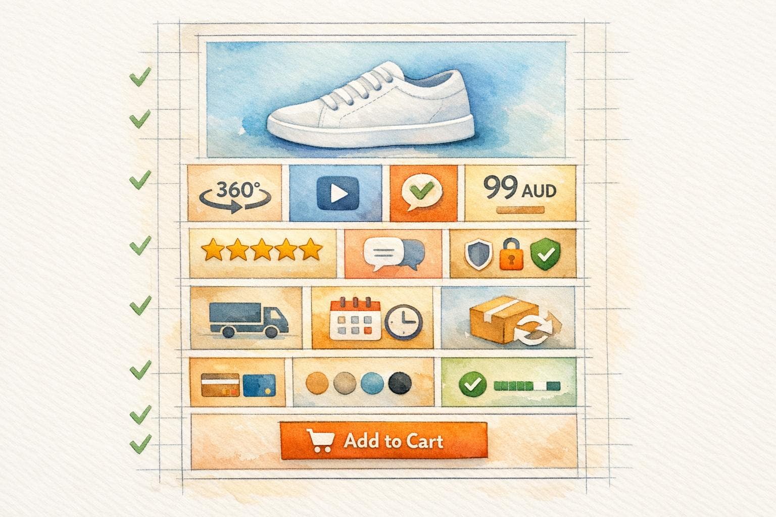
Your product page is the deciding factor for online sales. Here's why it matters:
- 93% of buyers prioritise visuals when making a purchase.
- Australian eCommerce conversion rates average only 1.5–3%, but the best stores hit 4–8%.
- 49% of carts are abandoned due to unexpected shipping costs.
- Mobile shoppers dominate, with 73% of traffic and 58% of purchases coming from mobile.
To boost conversions, your product page must deliver clear visuals, transparent pricing, and trust signals. These 14 elements can help:
- Hero Product Images: High-quality, zoomable images from multiple angles.
- 360-Degree Views: Interactive visuals for better engagement.
- Short Videos: Quick clips showcasing features or use.
- Benefit-Focused Headlines: Highlight customer value, not just specs.
- Bullet Points: Quick, clear descriptions linking features to benefits.
- Transparent AUD Pricing: Show total costs upfront, including GST.
- Prominent Add-to-Cart Buttons: Easy-to-see, thumb-friendly placement.
- Urgency Indicators: Low-stock alerts or countdown timers to drive action.
- Customer Reviews: Honest feedback, including photos and ratings.
- Trust Badges: Security seals and local payment options like Afterpay.
- Specifications Table: Clear, detailed product info.
- Cross-Selling Suggestions: Relevant add-ons to increase order value.
- Shipping Info: Clear delivery timelines and free shipping thresholds.
- FAQ Accordion: Address common questions without cluttering the page.
These elements recreate the in-store experience, reduce doubts, and encourage purchases. With small tweaks, even average-performing Australian stores can see conversion rates rise significantly.
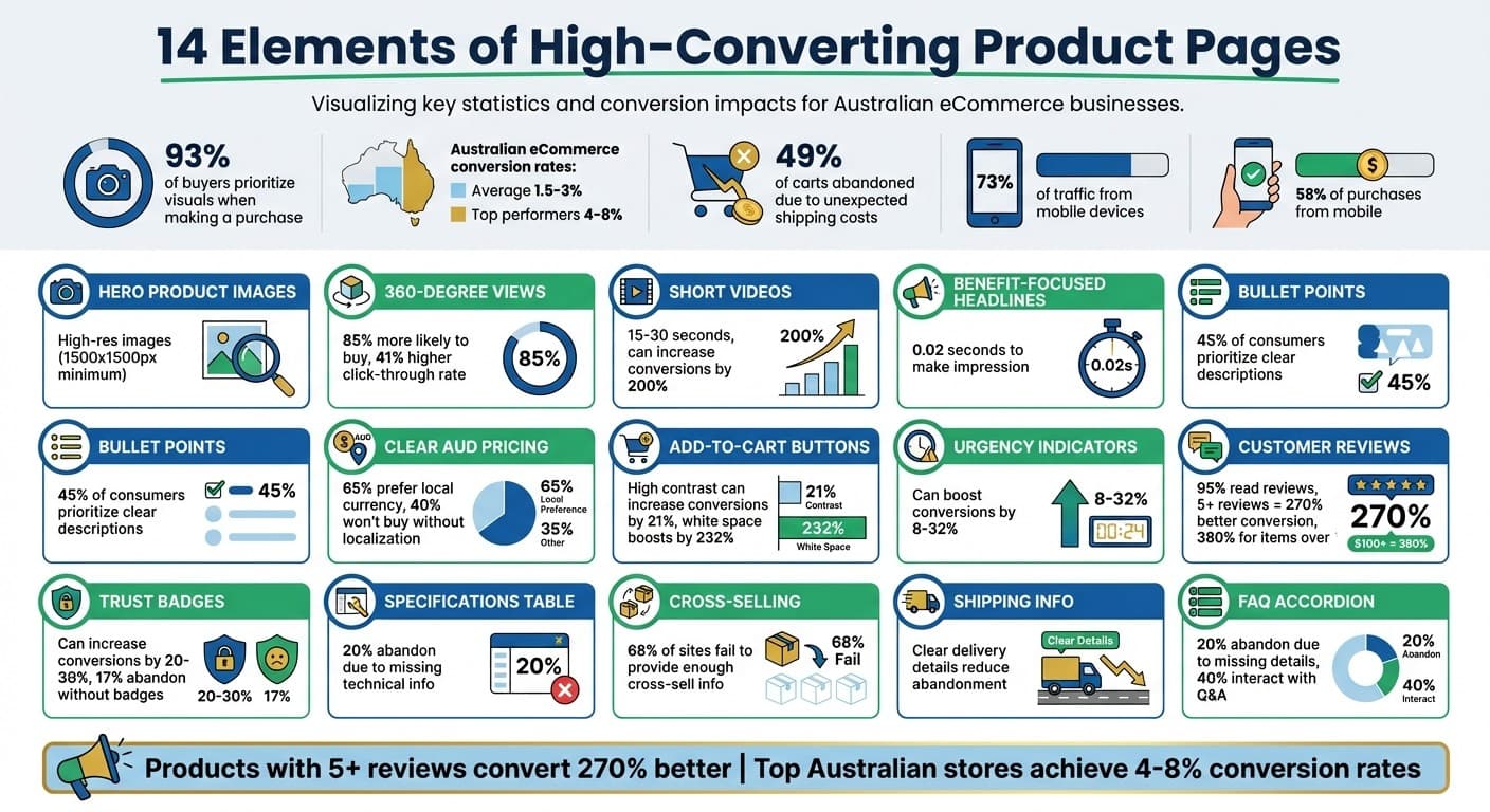
14 Essential Elements of High-Converting Product Pages: Key Statistics and Impact
1. High-Quality Hero Product Images
Visual Quality and Engagement
Your hero product image is like the digital equivalent of a shopfront display - it draws customers in and showcases the finer details of your product, such as texture, stitching, and finish. Using high-resolution images (at least 1500x1500px) ensures that zoom functionality works seamlessly, allowing buyers to closely examine the craftsmanship. This level of detail helps build trust and confidence in the product's quality. For better performance, consider converting images to modern formats like WebP or AVIF. These formats can shrink file sizes by 25–50%, keeping page load times fast while maintaining image clarity.
"My experience as a web designer has taught me that when it comes to ecommerce, people do judge a book by its cover, so invest in solid product photography." - Mark Perini, Founder, ICEE Social
Conversion-Focused Design Features
Showcasing your product from multiple angles - front, back, side, and close-up - can significantly enhance the shopping experience. Including a scale reference, like a hand or a common object, helps clarify the product's size, minimising confusion and reducing the likelihood of returns.
Combine clean studio shots with lifestyle images that show the product in real-world use. This pairing not only highlights the product's features but also helps customers imagine how it fits into their own lives. To further improve the shopping journey, link each image directly to its specific product variant (such as colour, material, or style). This ensures customers know exactly what they're selecting, boosting their confidence to make a purchase.
This visually rich approach sets the stage for additional interactive and descriptive features that can drive conversions even further.
2. Interactive 360-Degree Product Views
Visual Quality and Engagement
Interactive 360-degree product views turn passive browsing into active engagement. Instead of just glancing at static images, shoppers can rotate and explore the product with a simple swipe or click. This hands-on experience makes the product feel more tangible, bridging the gap between online shopping and in-store interaction. It's a subtle but powerful way to foster a sense of ownership before the purchase even happens.
The numbers back this up: shoppers who engage with interactive content are 85% more likely to buy, and pages featuring these elements see a 41% higher click-through rate in search results compared to plain text listings. Plus, this type of engagement sends positive signals to search engines, which could help boost your organic rankings.
Next, let’s dive into how design choices can turn this engagement into conversions.
Conversion-Focused Design Features
To make 360-degree views as effective as possible, start with high-resolution images (at least 1500x1500px). Adding a zoom feature is also essential, especially for products like tech gadgets, jewellery, or eyewear, where small details like textures, stitching, or craftsmanship can make or break a purchase decision.
Since 73% of eCommerce traffic now comes from mobile devices, mobile optimisation isn't optional - it’s critical. Use full-width carousels with intuitive swipe-to-rotate gestures and ensure tap targets are at least 44x44px for ease of use. To keep load times under 1.5 seconds, opt for modern image formats like WebP or AVIF, which can cut file sizes by 25–50% without sacrificing quality.
"These formats reduce the distance between the product and the user. The person isn't just looking at a photo; they are virtually interacting with the product." - Katia Gavrilenko, Copywriter, Crocoblock
3. Short Explainer Videos
Visual Quality and Engagement
Short explainer videos are the perfect way to bring your product to life, showing off its functionality and use in a real-world setting. These videos, ideally 15 to 30 seconds long, strike the right balance - they're long enough to highlight key features but short enough to keep viewers hooked. Incorporating multi-angle shots or 360-degree spins can mimic the tactile experience of shopping in-store, helping to ease any doubts buyers might have.
Product videos are one of the most effective tools for boosting conversions. For items that are more complex, videos demonstrating assembly or showcasing specific features can make a big difference by reducing uncertainty.
"When customers cannot touch, feel, or try on a product, images and video carry the entire sensory burden of the purchase decision." - Digital Applied
And there's more - choosing the right video settings can take engagement to the next level.
Conversion-Focused Design Features
Small tweaks in video design can make a big impact on how customers interact with your content. Set videos to auto-play muted to grab attention without annoying users. For clothing brands, showing models in motion can help customers see how the fabric flows and fits on different body types. Premium products? An unboxing video can heighten anticipation and clearly show what the buyer will receive. Similarly, before-and-after clips work wonders for products like skincare or cleaning supplies, where results are key.
Mobile optimisation is critical - ensure videos load quickly and maintain quality by using file formats like WebP or AVIF. And don't just tell buyers about a product's benefits - show them. For example, if you claim a jacket is water-resistant, include a clip of water rolling right off the fabric.
These thoughtful design elements can turn a simple video into a powerful sales tool.
Make high-converting product pages in 14 minutes
4. Benefit-Focused Headlines
After grabbing attention with visuals and interactive elements, your headline needs to deliver immediate value.
Clarity and Accessibility of Information
Did you know your headline has just 0.02 seconds to make an impression? That’s why focusing on benefits is key. Instead of simply listing specs like "200-thread count Egyptian cotton", highlight what it means for the customer: "Hotel-quality sleep at home - silky soft, stays cool all night". This approach answers the all-important "so what?" question that customers instinctively ask.
Research shows that users scan pages in an F-pattern, so place your headline prominently - either in the upper-left corner or across the top of the page. To make your product titles effective, follow this formula: [Brand] + [Product Name] + [Key Feature/Use Case] + [Size/Colour/Variant]. This method balances SEO needs with clear messaging, ensuring both search engines and shoppers instantly understand what you’re offering.
"The difference between a feature and a benefit is the answer to 'so what?' - translate every feature into the specific value it delivers to the customer." - Digital Applied
By focusing on these principles, your headlines can inform and motivate buyers at the same time.
Conversion-Focused Design Features
To turn benefits into action, your headlines should combine essential details with persuasive language that inspires immediate engagement. Use words like "you" and "your" to speak directly to the reader, steering clear of impersonal corporate jargon like "we". For technical products, include model numbers to attract highly motivated buyers searching for specific items. Pair your headline with a concise subheadline that provides extra context without overwhelming the page.
Here’s how a benefit-driven approach transforms product descriptions:
| Before | After |
|---|---|
| 10-hour battery life | Full workday on one charge - never scramble for an outlet |
| 2.4GHz wireless connectivity | 9-metre range - use it from anywhere in the room |
| Water-resistant coating | Spill-proof - wipe clean in seconds |
When it comes to Australian shoppers, straightforward language is key. They value clarity that helps them make quick, informed decisions. Make your headlines stand out by using bold text or larger font sizes to establish a clear visual hierarchy. Also, keep product titles under 60 characters to optimise SEO while maintaining readability.
5. Bullet-Point Product Descriptions
Clarity and Accessibility of Information
For 45% of Australian consumers, clear and accurate product descriptions are a top priority when shopping online. That's where bullet points come in. They align perfectly with the "F-pattern" scanning behaviour most shoppers use, making it easier to absorb critical details without reading every word. By presenting information in bite-sized chunks, bullet points reduce mental effort, helping to prevent shoppers from abandoning the page.
The magic of bullet points lies in their ability to connect features with benefits. Instead of leaving customers to interpret technical jargon, you can directly address the "so what?" of each feature. For example, instead of just saying "Water-resistant coating", you might write: Spill-proof - wipe clean in seconds, not minutes. This approach is especially valuable given that 20% of buyers abandon their carts when they can't find the information they need. Clear, concise bullet points also complement visuals, creating a more seamless shopping experience.
Conversion-Focused Design Features
Bullet points don't just improve clarity - they also drive conversions. For impulse buys under $50, concise bullet points showcasing key benefits outperform lengthy paragraphs. Focus on placing the most important details in the first few bullets, as many shoppers won't scroll through an extensive list. Use a friendly, straightforward tone and avoid technical jargon.
To make bullet points even more effective, pair them with high-quality icons that highlight features like "Australian Made" or "Free Shipping". For products with a lot of technical information, consider collapsible accordion sections. This keeps the page clean while still providing easy access to detailed specs. It's especially useful for mobile users, who make up the majority of eCommerce traffic and rely on scannable content for smaller screens.
"The easier it is for a customer to scan your page, the faster they'll convert." - Noun Project Team
6. Clear Pricing in AUD
Clarity and Accessibility of Information
When Australian shoppers visit your product page, they should instantly see the final price displayed in Australian dollars (AUD). Showing prices in AUD eliminates the hassle of currency conversion, making the buying process much smoother. Studies reveal that 40% of consumers won't buy from a site if the content isn’t tailored to their local preferences. Additionally, 65% of shoppers prefer pricing in their local currency, even if the design isn’t perfect.
Make sure the AUD price is placed prominently - above the fold, close to the product title and the "Add to Cart" button. Use bold, large fonts with high-contrast colours to make the price pop. For sale items, strike through the original price and highlight the discounted price in red to draw attention to the savings.
Trust-Building Elements
Clear pricing isn’t just about convenience - it’s also about building trust. Displaying AUD prices with GST included shows Australian shoppers that your store is catering directly to their needs.
"Don't hide costs and fees. Being upfront about any additional costs on the product page will help avoid surprises - and cart abandonment." - Shopify
To reduce cart abandonment caused by unexpected costs (a factor in 49% of abandoned carts), show the total price upfront, including estimated shipping fees in AUD. Reinforce trust further by featuring familiar local payment options like Visa, Mastercard, and Australian "Buy Now, Pay Later" (BNPL) services such as Afterpay.
Transparent pricing in AUD helps create a seamless shopping experience and strengthens the trust you’ve built with your audience.
Conversion-Focused Design Features
For higher-priced products, consider displaying BNPL instalments right next to the main price, such as: "4 payments of $49.75". This approach makes premium items feel more affordable without overwhelming the page with clutter. Psychological pricing tricks, like using $29.99 instead of $30.00, can also make a big difference. Shoppers tend to perceive the former as significantly cheaper, even though the difference is tiny.
On mobile, ensure AUD pricing remains visible with a sticky call-to-action (CTA) bar. Keep the surrounding area clean and free from distractions - every unnecessary element could be a lost sale.
Clear, transparent pricing in AUD not only builds trust but also sets the stage for high-performing call-to-action elements to drive conversions.
7. Prominent Add-to-Cart Buttons
Visual Quality and Engagement
A standout Add-to-Cart button can make all the difference when it comes to boosting conversions. It needs to be the most eye-catching element on your product page. If it blends into the background, shoppers might not even notice it. Studies reveal that 92.6% of customers prioritise visuals and imagery when making purchase decisions.
To grab attention, use high-contrast colours that differ from your brand's palette. For example, research found that switching to a red Add-to-Cart button from a green one led to a 21% increase in conversions. Design-wise, rounded corners give a softer, more approachable feel, while hover effects that change the button's colour signal interactivity and encourage clicks.
Clarity and Accessibility of Information
A visually appealing button is only half the battle - it also needs to be easy to find. Position the Add-to-Cart button above the fold so it’s instantly visible when customers land on the page.
"This is the most important component on the page, and should stand out from the surrounding content. The area around the button should be uncluttered so that there are no distractions or obstacles that block the user." - Maria Bonello, Director of Strategy, SMAKK Studios
For mobile shoppers, consider a sticky CTA bar that keeps the button within thumb’s reach. With 49% of mobile users holding their phones one-handed and 67% using their thumbs to navigate, placing the button at the bottom of the screen ensures accessibility and convenience.
Conversion-Focused Design Features
To maximise conversions, surround the Add-to-Cart button with plenty of white space. This simple design tweak has been shown to increase conversions by up to 232%. Keep the call-to-action text straightforward and direct - phrases like "Add to Cart" or "Buy Now" work best.
"Don't try to be clever with CTAs. Direct Add to Cart or Submit Order will do." - Courtney Hartmann Tisa, Internet Marketing Inc.
Adding urgency near the button can also drive action. For instance, real-time stock alerts like "Only 3 left!" can boost conversions by 8% to 32%, while urgency-focused CTAs have been known to increase conversion rates by up to 45%. For items that are out of stock, update the button text to "Notify Me" to maintain a positive user experience. And always make sure the button’s text matches its function - a "Buy Now" button should take users directly to checkout, while an "Add to Cart" button allows them to keep shopping.
8. Urgency and Scarcity Indicators
Visual Quality and Engagement
Urgency and scarcity indicators tap into our natural tendency to place higher value on rare items. When shoppers encounter a countdown timer or a message like "Only 3 left", it triggers FOMO (fear of missing out), pushing them to act quickly.
To make these cues more effective, use high-contrast colours like red or bright green for countdown clocks and low-stock warnings. Place these elements near the pricing or "Add-to-Cart" button, where customers are already focused on making a decision. Labels such as "Almost Gone!" or ticking timers amplify the sense of scarcity and urgency.
These visual tactics don’t just drive action - they also set the stage for trust when paired with transparent scarcity signals.
Trust-Building Elements
The key to urgency indicators is authenticity. If shoppers notice fake scarcity - like countdown timers that reset when they refresh the page - it can permanently damage their trust.
"Fake urgency destroys trust permanently when discovered." - Digital Applied
To strike the right balance, combine urgency with trust signals. For instance, alongside a "Limited Time Offer", include a money-back guarantee or clear return policy to ease any hesitation. Specific inventory counts, such as "Only 3 left", feel more transparent than vague warnings. Adding social proof, like "47 people viewing this item", backed by verified customer reviews, further validates the urgency and builds credibility.
Conversion-Focused Design Features
Effective urgency signals can significantly boost conversions when used strategically. For instance, quantity-based scarcity works well for limited-stock items, while time-based urgency is ideal for flash sales. Social proof adds another layer, with real-time updates like "12 people bought this in the last 24 hours" encouraging quick decisions.
Whether it’s a high-profile product drop or subtle scarcity messaging, urgency has proven to influence buyer behaviour. A/B testing shows that well-implemented urgency elements can increase conversion rates by 8% to 32%. However, it’s crucial to use these tactics thoughtfully - too much pressure can overwhelm shoppers and backfire.
9. Customer Reviews and Ratings
Visual Quality and Engagement
Did you know that 95% of shoppers read reviews before making a purchase? That makes how you present reviews on your product page a big deal. A visual summary at the top of the page - showing the average rating, total review count, and a star distribution chart - lets visitors quickly gauge product quality without wading through dozens of comments.
Clickable star ratings are a game-changer. They provide an easy path to the full reviews section, saving users time. Including customer photos and videos adds another layer of authenticity, giving buyers a glimpse into how the product performs in real life. Plus, displaying reviewer details like size or fit helps shoppers find feedback that feels relevant to them.
These visual and interactive elements aren’t just about convenience - they’re about building trust and confidence in your product.
Trust-Building Elements
While eye-catching visuals draw people in, honest reviews are what truly seal the deal. Shoppers trust products more when they see a mix of positive and critical feedback. In fact, a product with a few less-than-perfect reviews often feels more credible than one with only glowing 5-star ratings. Interestingly, most buyers feel confident in a product after reading just 5–10 reviews.
Verified purchase badges are another way to build credibility. For example, Sephora highlights a green "verified purchase" label on reviews, assuring customers that the feedback comes from real buyers. Rent the Runway goes even further, allowing users to filter reviews by body measurements and sizes, so they can find feedback that’s tailored to their needs.
Responding to reviews - especially negative ones - shows accountability. As Tara Minh from Rework puts it:
"A good response to a negative review can turn a detractor into an advocate".
Wildebeest takes it up a notch by pairing customer reviews with their quality guarantee right on the product page, doubling down on trust signals.
Conversion-Focused Design Features
Strategic design choices can turn trust into sales. Placing star ratings and the average score at the top of the product page, above the fold, ensures buyers see them early in their shopping journey. Adding a numerical rating (like "4.7/5") next to the stars makes things even clearer.
Here’s the impact: Products with at least five reviews convert 270% better than those without any. For high-ticket items over $100, having five reviews boosts purchase likelihood by 380%. And photo or video reviews? They can increase conversion rates by 21% to 29%.
To make reviews even more useful, include "helpful/not helpful" voting buttons so top insights stand out. Sorting and filtering options - by rating, date, or reviewer traits - help shoppers quickly find what matters most to them. For mobile users, keep things simple by showing up to 10 reviews initially and using a "Load more" button to maintain a smooth browsing experience.
These thoughtful design elements don’t just enhance usability - they directly contribute to higher sales.
10. Trust Badges and Security Seals
Trust-Building Elements
Trust badges and security seals play a key role in giving buyers the confidence to complete their purchase. In fact, shoppers often decide if a site is trustworthy within 3–5 seconds. These badges signal that your business is legitimate, payments are secure, and purchases are protected. As Forged Catalyst explains:
"Trust signals bridge this gap. They're the visual and textual cues that tell visitors your business is legitimate, your products are quality, and their purchase is protected".
The statistics speak for themselves - sites that incorporate trust signals can see conversion rates jump by 20–30%. On the flip side, 17% of shoppers abandon their carts because they don't see trust badges.
The most effective trust badges generally fall into four categories:
- Security seals: SSL certificates, Norton Secured, McAfee Secure.
- Payment icons: Visa, Mastercard, PayPal, Apple Pay.
- Third-party certifications: BBB Accreditation, PCI Compliance, or industry-specific seals.
- Risk-reversal badges: Money-back guarantees, free shipping, or easy returns.
If you're targeting Australian shoppers, include your ABN in the footer, a local contact number, and popular local payment options like Afterpay or Zip. These details resonate strongly with Australian buyers and help establish your store's legitimacy.
Conversion-Focused Design Features
Where you place trust badges is just as important as the badges themselves. The best spot? Near the "Add to Cart" button. This is the critical moment when buyers are deciding whether to commit, and trust signals here can increase conversion rates by 10–15% by easing last-minute doubts.
However, it’s important not to overdo it. Stick to 1–2 key badges that your audience will immediately recognise. Maria Bonello, Director of Strategy at SMAKK Studios, advises:
"The area around the [CTA] button should be uncluttered so that there are no distractions or obstacles that block the user".
Only display certifications you've genuinely earned - anything else could damage your credibility.
For mobile shoppers, who now make up over 70% of eCommerce traffic, ensure trust signals are clearly visible on smaller screens. Sticky CTA bars that keep security icons in view while scrolling can work wonders. And don’t forget: 85% of consumers won't shop on sites without a secure HTTPS connection. That padlock icon in the browser bar? Absolutely non-negotiable.
When used thoughtfully, these trust signals provide the reassurance buyers need to confidently proceed with their purchase.
11. Detailed Specifications Table
Clarity and Accessibility of Information
A detailed specifications table is a must-have element for any high-converting product page. It helps remove doubts for cautious shoppers by providing the precise details they need to make informed decisions. When customers can't physically interact with a product, specifics like measurements, weight, materials, and technical details become crucial. In fact, 20% of shoppers abandon purchases simply because they can't find the technical information they’re looking for.
The way this information is presented matters. Research shows that 27% of users overlook specifications when they're hidden in horizontal tabs, compared to only 8% when the details are displayed in vertical formats. For Australian eCommerce stores, vertical, collapsible sections work well to organise technical details in a user-friendly way.
Using simple, everyday language is equally important. As Rosara Joseph, Content Strategist at VentureWeb, explains:
"The paramount goal for your product pages should be to build user confidence by providing all the information necessary for a purchasing decision and making the process as intuitive and straightforward as possible".
For example, instead of saying "10-hour battery life", rephrase it to something more relatable like "Full workday on one charge." This approach makes the information more accessible and reinforces trust.
Conversion-Focused Design Features
To enhance usability, especially for mobile shoppers - who now account for 73% of eCommerce traffic - collapsible sections are a smart choice. They allow users to quickly access critical details without excessive scrolling. Place key specifications, such as dimensions or sizing, near the 'Add to Cart' button to address any last-minute doubts.
It's also essential to customise technical details based on your industry. For clothing, detailed sizing charts can ease the concerns of the 45% of consumers who worry about finding the right fit online. For electronics or appliances, include information like model numbers, power requirements, and warranty details. As Dan Magill from WooCommerce points out:
"If your site has hardly any information and your competitor has a lot, they'll be more likely to make the sale. This is increasingly true as products become more technically complex".
For higher-priced items, including details like material origins or quality certifications can help justify the cost and build buyer confidence. These thoughtful touches can turn hesitation into a purchase.
12. Cross-Selling and Upsell Recommendations
Clarity and Accessibility of Information
Cross-sell and upsell recommendations can be a great way to increase your average order value - but they only work if customers can easily understand them. Surprisingly, 68% of desktop eCommerce sites fail to give enough information about cross-sell items on product pages. This lack of detail often pushes shoppers away from the main product page, creating unnecessary friction and potentially losing sales.
To make these recommendations effective, they should include four key elements: a high-quality thumbnail, a clear product title, AUD pricing, and user ratings. However, many sites fall short - 55% shorten product titles, and 15% don’t even show the price. Sally Collins, Senior UX Researcher at Baymard Institute, explains:
"Truncated product titles increase users' efforts to assess whether any of the alternative cross-sell recommendations... are a suitable replacement to current item".
For instance, if a shopper can’t tell if a recommended product is a "wireless mouse" or a "wireless keyboard", they’re unlikely to click on it.
On desktop, you can improve clarity by including a secondary thumbnail that appears on hover, showing an alternate angle or a lifestyle shot without adding clutter. For mobile users, ensure all essential details - like product name, price, and ratings - are displayed upfront, as mobile shoppers are less likely to navigate extra pages for basic information.
These steps create a solid foundation for introducing features that focus on driving conversions.
Conversion-Focused Design Features
Once the basics are covered, you can implement design strategies to further increase conversions. Place cross-sell recommendations near the main product details, ideally in the footer, without distracting from the "Add to Cart" button. Mark Macdonald from Shopify cautions:
"Going overboard with related products and banners on your product pages can feel overly aggressive and spammy, cause decision paralysis, and distract shoppers from actually completing their intended orders".
Keep recommendations relevant to the main product. For example, suggest compatible accessories like lenses or bags for a camera, or show "Complete the Look" options for clothing. Using labels such as "Customers Also Bought" adds a layer of social proof, while a "Quick Add" button for smaller items like batteries or cables can make it easier for customers to add these extras without overthinking. These tactics streamline the shopping experience and help guide customers toward completing their purchase.
13. Shipping and Delivery Information
Clarity and Accessibility of Information
High-quality images and clear pricing help build trust, but detailed shipping information is what keeps buyers confident all the way to checkout. For Australian shoppers, seeing the total cost - including shipping and taxes - upfront is non-negotiable. Hiding these details until the last step often leads to cart abandonment.
How you present shipping details is just as important as the information itself. Horizontal tabs, for example, are a bad idea - 27% of users miss content in this format. Instead, opt for vertical accordions or collapsible sections labelled clearly, like "Delivery & Returns." This simple change reduces oversight to just 8%. When writing your shipping details, focus on clarity and specifics. Avoid vague phrases like "ships in 3-5 business days." Instead, say something like, "Arrives by Thursday if you order today.". This removes uncertainty and makes the buying process feel more reliable. Clear communication here not only informs but also builds trust.
Trust-Building Elements
Transparent return policies and delivery guarantees go a long way in reducing the perceived risk of online shopping. Casper, the mattress brand, is a great example of this. They placed delivery details right next to the call-to-action button and added a hoverable question mark icon. This allowed customers to view specific delivery times and policies by region without cluttering the page.
If you offer perks like free shipping above a certain spend - say, "Free shipping on orders over $50" - make sure this is displayed prominently. Slyde, a brand selling bodysurfing handboards, saw a boost in conversions by highlighting their free shipping offer and "stress-free" returns promise near product add-ons on their product pages. These trust signals work best when placed above the fold or right next to the "Add to Cart" button, where they’re impossible to miss.
Conversion-Focused Design Features
To drive immediate action, pair shipping details with urgency cues. For example, a countdown timer for next-day delivery can create a sense of urgency. Tailor your delivery expectations to match local needs. Uniqlo did this brilliantly by updating their imagery to reflect local climates, ensuring customers felt their needs were understood. Combining clear shipping info with urgency creates a seamless and tailored shopping experience.
14. FAQ Accordion for Common Questions
Clarity and Accessibility of Information
An FAQ accordion is a smart way to keep your product page tidy while still providing essential information. Collapsible sections can house details like technical specs, care instructions, or warranty terms, ensuring the page stays easy to scan and your main call-to-action remains prominent. Missing details can be a dealbreaker - 20% of shoppers abandon purchases for this reason. With an accordion, customers can quickly find what they need, whether it's sizing, materials, or compatibility.
"Product descriptions alone will never be able to answer the virtually endless number of questions and concerns that users may have about a product – even if a site could predict and afford to answer all of these questions, it would turn the product description into a lengthy novel." - Jamie Holst, Co-Founder, Baymard Institute
Make sure your headers are specific and descriptive. Instead of vague labels like "More Info", try something like "What's it made from?" or "How do I clean this?". Design for usability by making both the icon and header text clickable, with tap targets sized between 44px and 48px for mobile users. Familiar icons like carets (▶/▼) or plus/minus (+/-) symbols are ideal because they signal interactivity at a glance.
Next, we'll look at how FAQs can address buyer concerns to build trust.
Trust-Building Elements
A well-thought-out FAQ does more than answer questions - it builds trust by addressing common doubts directly. Focus on concerns like sizing, durability, and return policies. For instance, instead of simply stating "water-resistant", explain the benefit: "Spill-proof - wipe clean in seconds". Including a community Q&A feature alongside your FAQs can also be powerful. 40% of users interact with community Q&A sections, often trusting peer answers more than the manufacturer's claims. Transparency about product origins, certifications, and production processes further reinforces trust.
Conversion-Focused Design Features
Position your FAQ accordion near the Add-to-Cart button and keep it collapsed by default to maintain a clean, distraction-free layout. This placement helps reduce hesitation at a critical decision point. Avoid overcomplicating things - nesting one accordion inside another can confuse users and make navigation harder. For mobile users, accordions are especially helpful in reducing text overload while keeping the main call-to-action easily accessible. By addressing common concerns directly on the product page, you reduce the chances of customers leaving to search for answers elsewhere, which often leads to cart abandonment.
Conclusion
Turning casual browsers into paying customers requires removing obstacles at every step of their journey. These 14 elements act as substitutes for the in-store experience, address common objections, and help build trust with Australian shoppers. High-quality images play a crucial role, stepping in to provide the sensory experience customers miss when they can’t physically interact with products. Meanwhile, customer reviews and trust signals help ease doubts, and clear AUD pricing paired with transparent shipping details can significantly cut down the 49% of cart abandonments caused by confusion.
"Product photography is the most direct substitute for in-store tactile experience. When customers cannot touch, feel, or try on a product, images and video carry the entire sensory burden of the purchase decision." – Digital Applied
Products with at least five reviews see conversion rates jump by 270% compared to those without. Similarly, urgency signals - when used appropriately - can boost conversion rates by 8–32%. Video content is another powerful tool, increasing conversions by up to 200% in some cases. While the average eCommerce site converts at just 1.5–3%, top-performing Australian stores reach 4–8% by fine-tuning these critical elements. And with 73% of traffic coming from mobile devices, ensuring mobile-friendly navigation and quick load times is non-negotiable.
The benefits of optimising product pages are undeniable. For Australian eCommerce businesses ready to take the plunge, Uncommon Insights offers services like conversion audits, A/B testing frameworks, and advanced analytics to pinpoint what drives results. Their approach focuses on meeting local expectations around shipping, returns, and payment options.
With strategic design improvements and systematic testing, Australian businesses can see conversion rates soar by 20–50%. Start by focusing on the elements with the highest impact, test rigorously, and let the data guide your decisions.
Related Blog Posts
Shopify conversion rate optimization checklist
How to Optimize Above-the-Fold Content for DTC Brands
10 A/B Testing Ideas for eCommerce Ads
Funnel Bottlenecks: Causes and Solutions
5 Ways to Reduce Cart Abandonment Rate in 2025
How to Map DTC Customer Touchpoints
Newsletter
The Uncommon Insights Letter
Practical FMCG & eCommerce growth playbooks — margins, retention and scaling tactics, straight to your inbox.
Turn these ideas into profit you can see
Get a hands-on operator to turn the frameworks above into results — book a free audit call.